Outdoor Branding
Finding Your Voice: Using Typography for Brand Awareness
Reader attention is a valuable resource, and typography is a tool that helps conserve that resource.
Great typography is more than just picking a font that works and typing your message. Typography becomes the voice of your brand. It should be an expressive way to define yourself, attract attention, and create a sense of clarity in a positioning statement.
An easy format to understand the importance of typography is a resume. Think of the difference between what comic sans and times new roman say about your level professionalism. It would be clear to a person making hiring decisions what they type of person they were dealing with just by looking at the chosen typeface (and hopefully that comic sans tragedy quickly makes its way to the recycling bin).
As stated earlier, typography can be the “voice” of your brand. It’s important for businesses to use similar (if not the same) typefaces throughout all of their written media in order to take advantage of this voice. Possibly the most notable example of this is Coca-Cola Classic. Even just reading the name brings to mind the beautifully scripted white lettering and the bright red that has become synonymous with the brand. You trust it to be the same great soda you’ve always had and the classically hand-lettered script evokes that sense of trust, tradition, and Americana. Often they don’t even have to write the name of the brand as in the new “Share a Coke Campaign” where even when replaced with a series of different names, it’s still clear that it is a Coca-Cola.

Wait… That’s not right…
When dealing with large format advertising like billboards, banners, and signs, it’s important that your brand message remains clear, while still evoking a sense of style. Bold, all-caps type is legible at a distance, but think of the last 10 large-format ads you saw. How many of those had the same bold, all-caps typography with a product image and a website at the bottom? The format works, but it seems to be lacking expression or true brand awareness.
What separates a good, but generic ad from a great, expressive, brand-positioning piece is the way it’s presented. Unique (but readable!) typography is a simple way to define who your company really is and get your main message across. Consider more than just font choice. Line spacing, color, kerning, white space, and contrast all have an effect on what you’re saying. A white background featuring a one-line message in a black, serif font reads as traditional, classic, and dramatic thanks to the journalistic typeface and high contrast. Compare this to a brightly colored script font on an image of millennials. The words that come to mind are bold, fun, and high-energy. It harkens back to the old saying- it’s not just what you say, it’s how you say it.
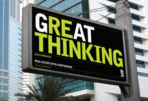
You have 3 seconds to make an impact. What stands out to you? Check out these creative typographic pieces and see the difference:
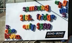


(3-4 example type billboards)
- http://scmonterroso-compgraph.blogspot.com/2012_10_01_archive.html
- http://demortalz.com/2011/09/10/how-can-you-use-typography-art-effectively/
- https://www.quora.com/Whats-a-better-degree-to-get-graphic-design-interior-design-fashion-design-or-psychology
- https://beyondm25.wordpress.com/tag/typography/page/2/
- http://designyoutrust.com/2011/09/the-mirror-effect-how-to-exceed-the-maximum/
Together, we can create a cohesive brand voice through outdoor advertisements. Getting noticed is easy, but helping you become a recognizable image in the Edmonton area is our goal. It takes time to build a brand voice, but with well placed outdoor pieces and and a mind for tools such as typography, we can help make it happen
