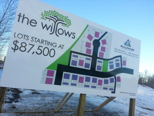
The Willows Development sign is a great example of the classic triangle tool which is often taught in graphic design classes and used in developing images. If you look carefully at the sign, you can see the three top elements and how they are arranged.
First of all, the way the sign is erected on simple wooden sawhorse type positioned at the appropriate angle and made of simple wooden board supports gives off the air of a drafting table, which is very successful especially with the poster being rectangular as the top of a drafting table is. This is a perfect way to introduce the viewer to the concept of development in progress that they can get in on if they so desire. The poster itself is enormous and white, easy to see and in good but not stark contrast to the images and typeface.
The plot plan is in the middle, resembling a subdivision mylar that you would see in a surveyor’s office, spread out on the desk. It automatically makes you feel like you are dealing with careful, thorough professionals who want you to see exactly what you are getting from the very beginning. The lots are even color coded into purple and blue, with the proposed road being a dark black, the access road very thickly portrayed and then the cul de sac leading off to a trail, one assumes a walking trail to a park of some sort. Sidewalks are also visible around the perimeter of the central block of houses, and off to the right in the foreground. Grassy landscaping is suggested by the color green which sweeps up the left side of the central map.
To the left, we have the proposed name of the subdivision along with the price, while the caveat “STARTING AT” is in smaller letters than the big starting price, meant to draw you in. The color scheme echoes the one used for the map, with the Name “willows” in a dark blue or black, and the green used in a very creative way to form leaves, while the two ills of willows are the trunk of a willow tree. Indeed, the leaves are falling a bit on the left, and form the dot of the i. The font is large, clear and simple, enough to be in a nursery, really, but professional and crisp enough to work here, when coupled with the leaf motif, it gives the whole sign just the right amount of whimsy.
And to the right, subtly but artfully displayed, is the company logo, a triangle to highlight the triangular position of the three elements of the sign mentioned above. The font is smaller, and of a different color, making the eye realize that that is the brand of the company and is to be distinguished from the developer’s map. Contact information is displayed in a reserved but easy to remember manner. In the lower right corner is some further information which is not meant to be the center of attention, probably something required by law to be posted.
A good, clean sign design.